fete fitness
Fete Fitness was created by Farrah, drawing inspiration from her Caribbean carnival experience and her passion for fitness. The brand brings the excitement and energy of carnival to the dance floor, with high-intensity classes set to a diverse mix of hip-hop, pop, funk, trap, soca, dancehall, afrobeat, and more.
I was tasked with designing a logo that reflected the intensity, fun, and energy of Fete Fitness. The logo needed to embody Farrah’s story and connection to dance, while also incorporating the symbolic significance of feathers. Feathers represent Farrah’s journey as a young dancer who overcame fear with faith—a story that’s deeply personal and empowering. Additionally, the Fete Fitness program is inspired by the wind beneath Farrah’s wings: her daughter and tiny dancer, Kaylee.
My concept for the logo revolves around a circular shape, symbolizing life’s journey, with feathers acting as support, guiding you to where you’re meant to land. The color palette is vibrant and dynamic, mirroring the lively energy of carnival and the infectious excitement Farrah brings to every class she leads.
Inspiration
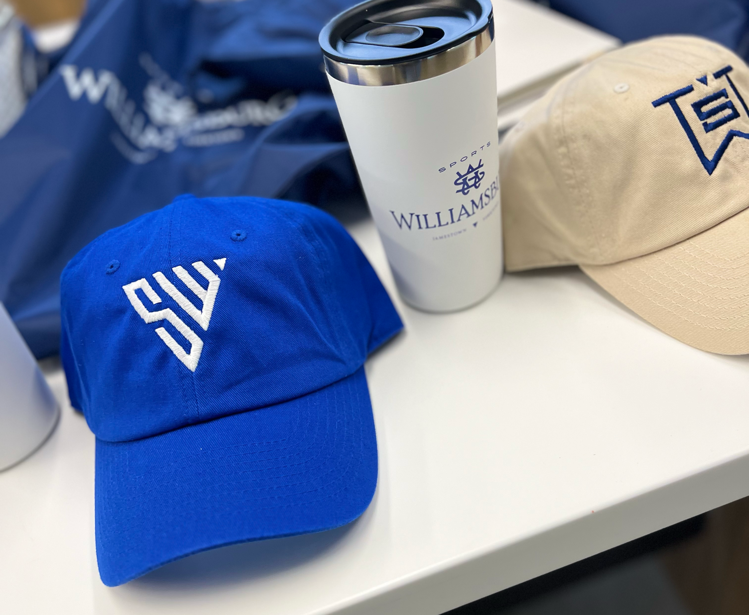
Sports Williamsburg
W64 was tasked with creating a brand and campaign for Sports Williamsburg's new sports initiative aimed at promoting the region’s state-of-the-art sports complex. The goal was to increase tourism, drive bookings for sporting events, and boost overnight visitation to the area.
In our concepting sessions, our team drew inspiration from the spirit of competition and the adrenaline-fueled desire for non-stop action. We envisioned Williamsburg as a city that would channel this energy into its facilities and event support, giving athletes the environment they need to perform at their best, push their limits, and reach new heights. But the excitement doesn’t end when the tournament finishes. Williamsburg has countless activities to keep the adrenaline pumping. From courts and fields to roller coasters and beyond, there’s always something to keep your heart racing.
Our campaign tagline, Play On, encapsulated this high-energy, action-packed vision. Although this concept was not ultimately selected, it was one of the top contenders.
Elizabakes
Elizabakes Cakes is a charming small business based in Washington D.C., specializing in custom cakes for a variety of events, from weddings to birthday parties. Though she’s built a loyal customer base primarily through word-of-mouth referrals, Elizabakes wanted to establish a brand identity that could effectively communicate her business to a wider audience—something that felt both timeless and whimsical.
Inspired by all things French, Elizabakes' aesthetic draws from soft pastel colors like pinks, creams, light seafoam blues, and greens. I took this inspiration and designed a brand identity that reflected her love for elegant, playful design. The result is a visual identity that feels classic, yet fresh—just like the cakes she creates.
Educate Fairfax
My challenge was to develop a brand identity for the Foundation for Fairfax County Public Schools that would unify messaging and inspire belief in the cause. The Foundation's audience—including alumni, parents, corporations, and grant committees—often perceives that Fairfax County Public Schools don’t require additional funding due to the area’s relative wealth. However, the goal was to shift this perception and show that donations truly make a difference, particularly for students who are on the margins.
The client sought to update their existing logo to something more accessible, modern, and authoritative, yet innovative and slightly unconventional. With these goals in mind, I designed a logo centered around the concept that the strength of the Fairfax County community lies in the support it provides to its students.


